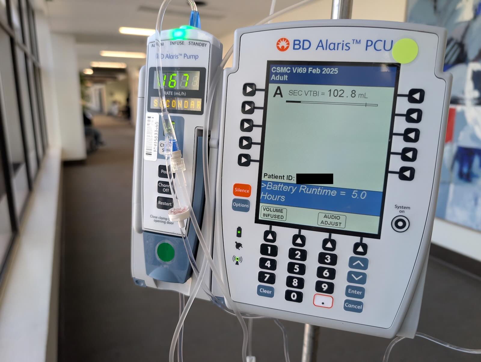
Medical equipment interfaces are interesting because one can safely assume the users are trained medical personnel and not the public. However, there's still a very strong incentive to make them intuitive and accessible as people's lives can be on the line.
Presumably they chose an abundance of soft keys here to allow for as much flexibility as possible, but I find the whole thing rather vexing:
- There's separate icons for battery and AC power (why?)
- There's a dedicated and differently colored button to silence the machine (why not an icon?)
- A very generic circular button labeled "System on" seems like the entirely wrong modality (a "⏻" flip switch could have sufficed)
- The large, italicized ">Battery Runtime = 5.0 Hours" is a very strange way to convey that information
Surely there are many other factors at play that led to these design decisions, and there's probably plenty to learn from being a fly on the wall at the software department of a huge medical conglomerate like BD, but come on. Can't we do better?