Light switches are one of those things that we've collectively figured out pretty well. A light in a room, a nearby switch to control it with a clear on/off state and tactile feedback.
Intuitive. Clear.
And then you get presented with something like this, which hangs on some random wall in your hotel room.
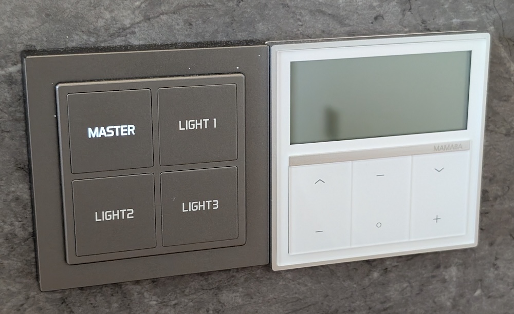
How do I turn on the bathroom light? Is it LIGHT 2? Or maybe LIGHT 3?
Wait. A light just turned off. Which one was that again? Is it on or off?
Now imagine doing that in the middle of the night because you need to use the bathroom. You've likely completely blinded yourself multiple times by the time you figure out which button is the right one to press.
It's infuriating. It breaks spatial mapping, intent-action mapping, proximity principles, and is objectively worse in nearly every way.
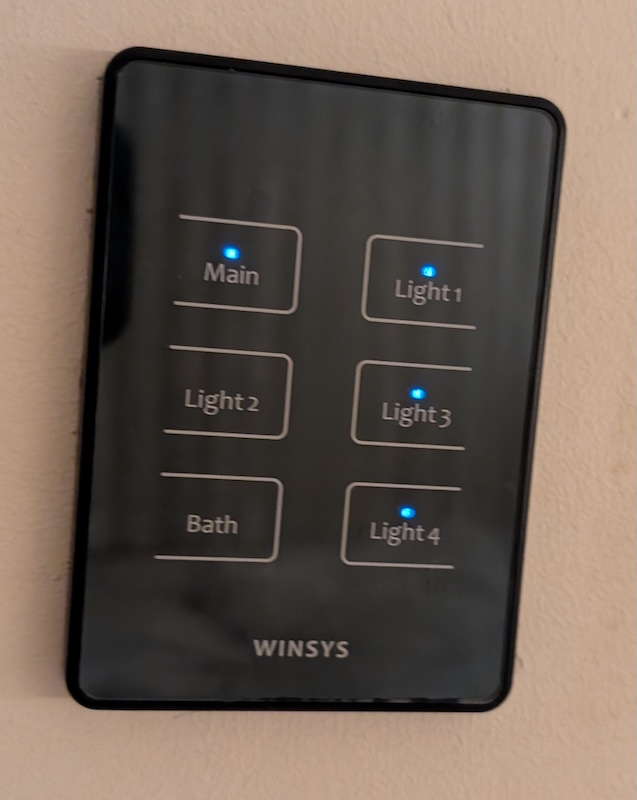
This one might even be worse than the one above, because while it does implement state feedback, it's inverted. Yep. When the LED is off, the actual light is on. Presumably to make it easier to use in the dark, but so, so, stupid.
(Side note: I hoped this was an anomaly, but I ended up finding these everywhere in South Korea. I wonder why.)