Japan has a history of having interesting interfaces that significantly diverge from western countries, but while many differences can be plausibly attributed to differences in script and culture, it's fascinating to me that they still seem to have a knack for throwing common affordances out the window and saying, "fuck it, we're doing it our way".
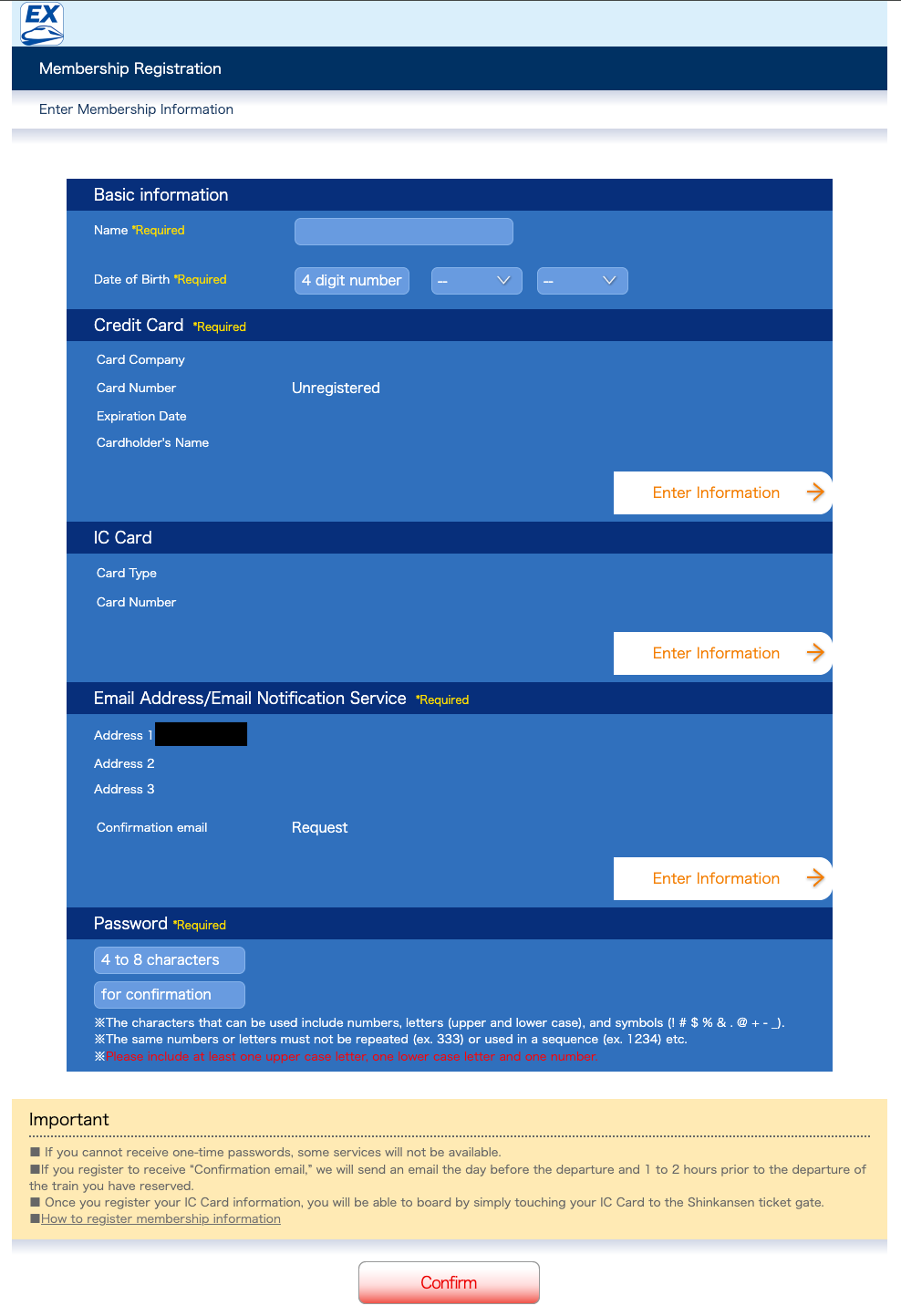
Case in point, the sign-up form for Japan's Smart EX Shinkansen ticketing system.
- Strange arrow links to go to other pages to fill out subforms
- Weird floating text
- Offbeat bullets
- Quirky button design
You'd think usability and accessibility would be more important for a public transport service site...