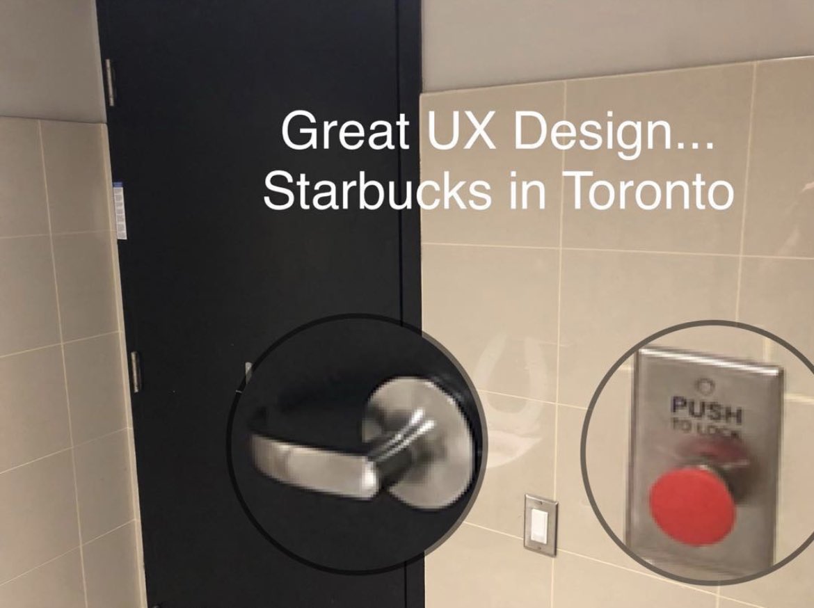
This is the worst UX I’ve seen. Didn’t find how to lock the door until I was exiting the bathroom 🤦♂️
(Source: @vponamariov)
This is the worst UX I’ve seen. Didn’t find how to lock the door until I was exiting the bathroom 🤦♂️
(Source: @vponamariov)
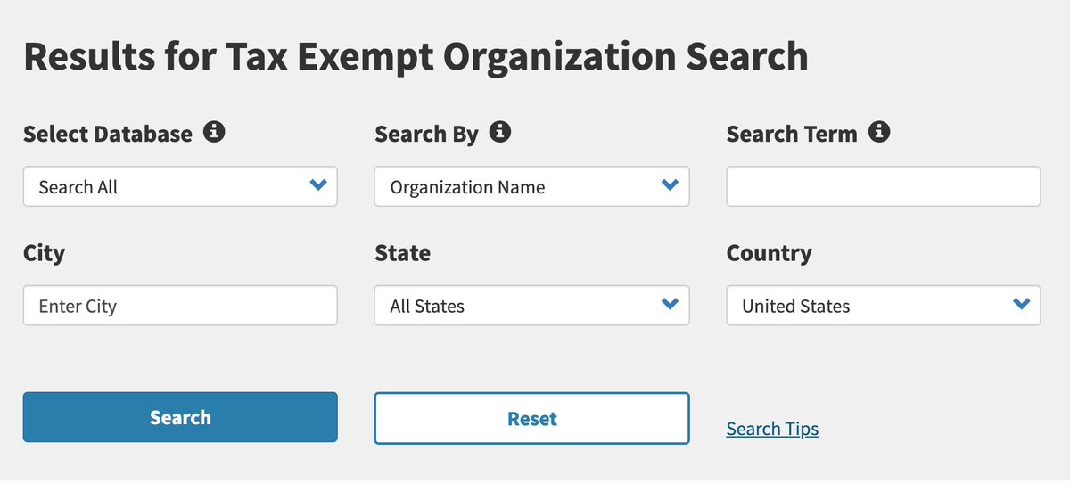
Search forms almost never need to be more than just one text box - don't overwhelm users with lots of options, @IRSnews. (Or put it on an "Advanced Search" page, at least)
And for god's sake, "Reset" does not deserve to be the same size as the "Search" button. Nobody uses that shit.
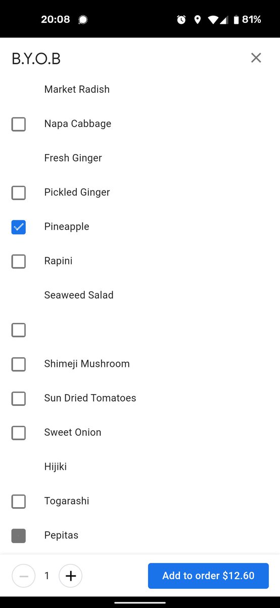
UI checkbox party at @Google, but some of you are NOT invited.
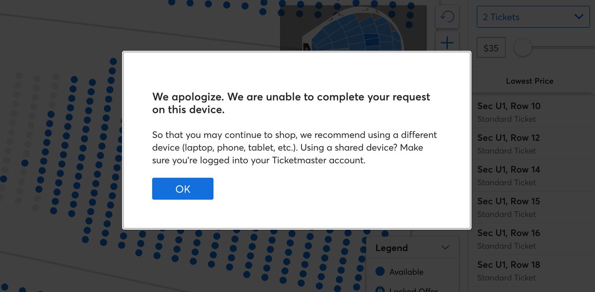
If something fails in your app, at least have the courtesy to tell your users why, @Ticketmaster. Greying out the "Next" button without any explanation is a road to frustration.
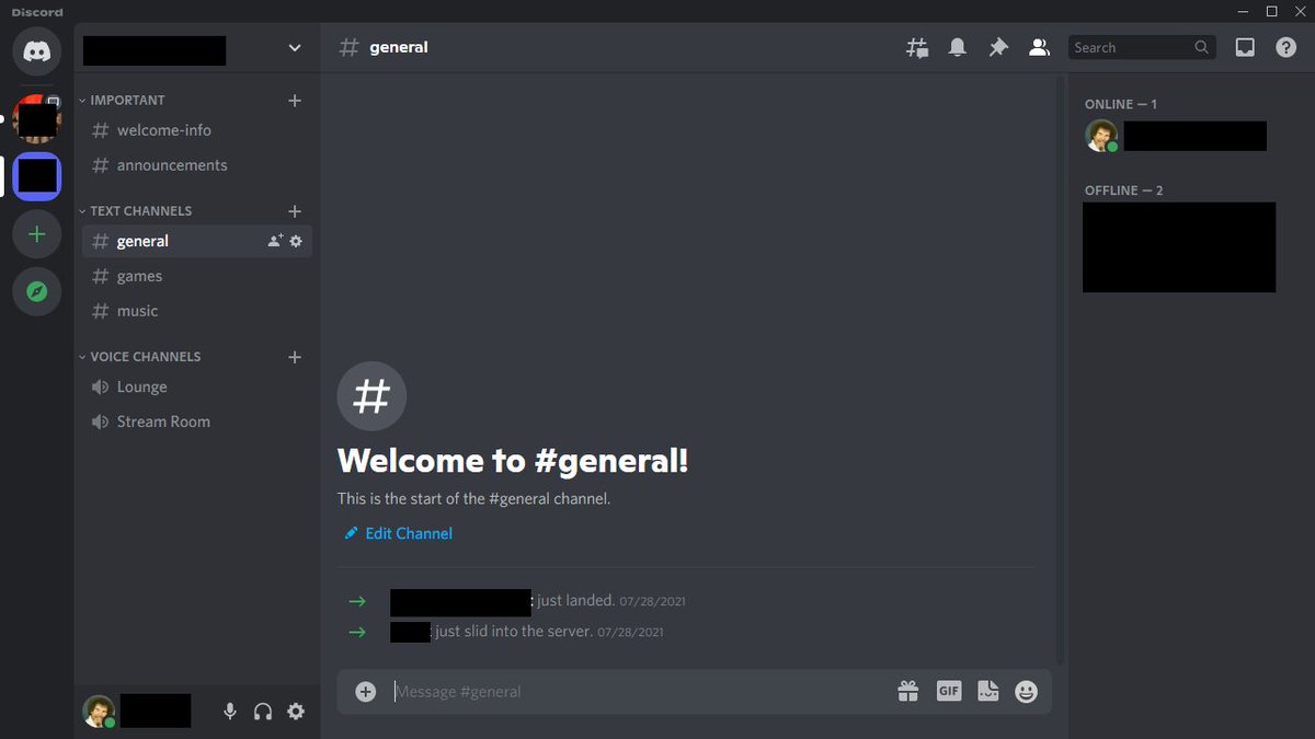
Is the microphone on? Or off? @discord's UI is confusing as fuck. Whether my voice is being broadcast is not something I should have to wonder about.
HBO Max bravely answers the question "what if the people who designed an app fucking hated their customers”
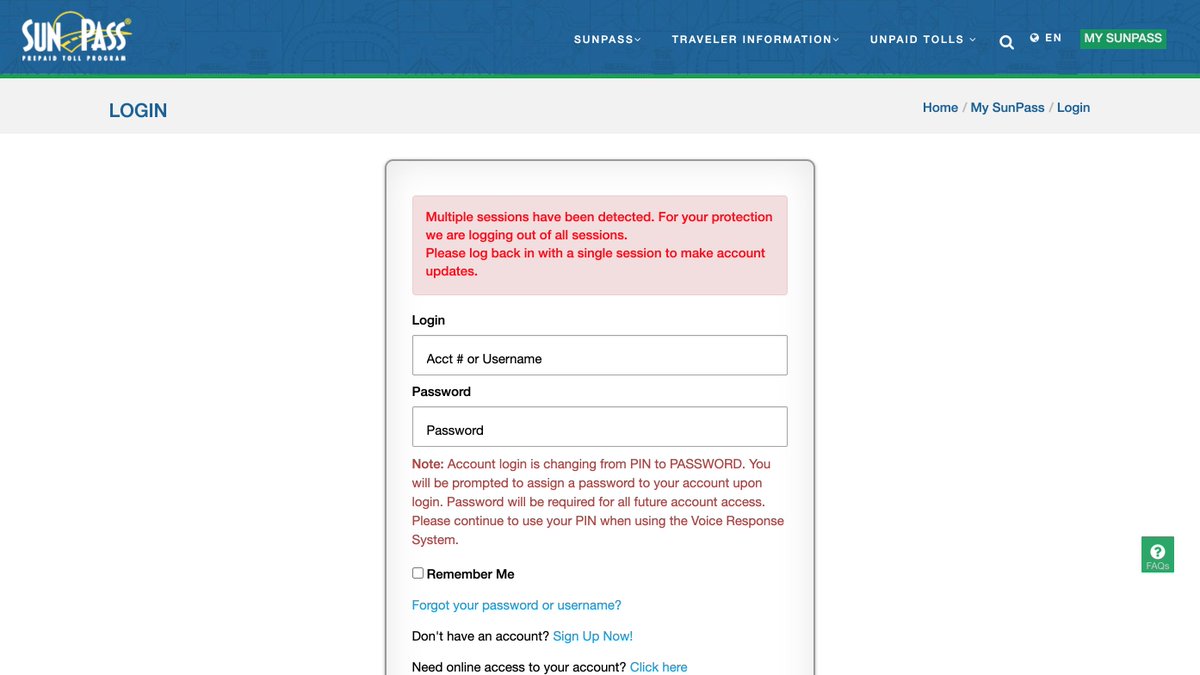
@SunPass_FDOT, Round 2: God forbid you open up another tab to multitask... 😑 This reeks of something designed by an "IT Security Manager, Level II".
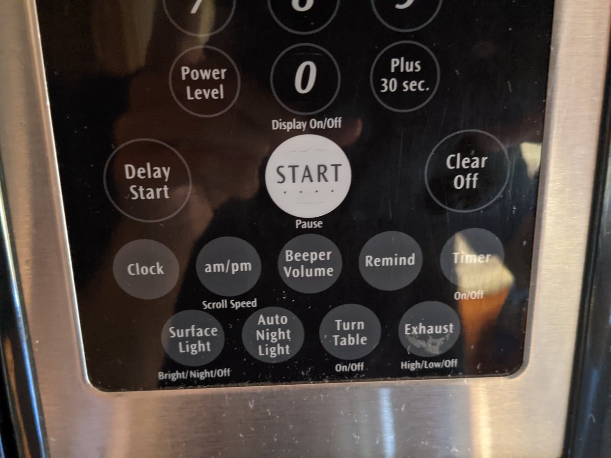
There is no microwave is the world that needs a dedicated "am/pm" button @ElectroluxUS @Frigidaire
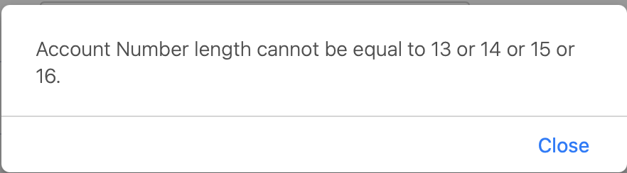
But 118 characters is completely fine.
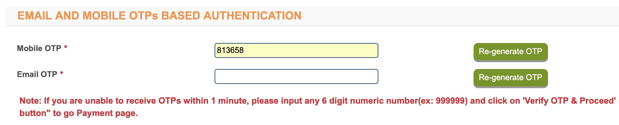
(Source: HDFC Bank Ltd. E-banking.)
Presenting the eNPS portal by KFintech.
If things are so easy, why do we complicate them so much?