Fuck your notifications, pre-checked boxes and your "Add to home screen" widget. Seriously. If your content is engaging users will subscribe to you. This just ensures they will never return, @slate.
Fuck your notifications, pre-checked boxes and your "Add to home screen" widget. Seriously. If your content is engaging users will subscribe to you. This just ensures they will never return, @slate.
Buttons on touch interfaces should almost always have large hit areas. Also, don't use mouse emulation on your touch screens @Target
(Source: @kayvanCM)
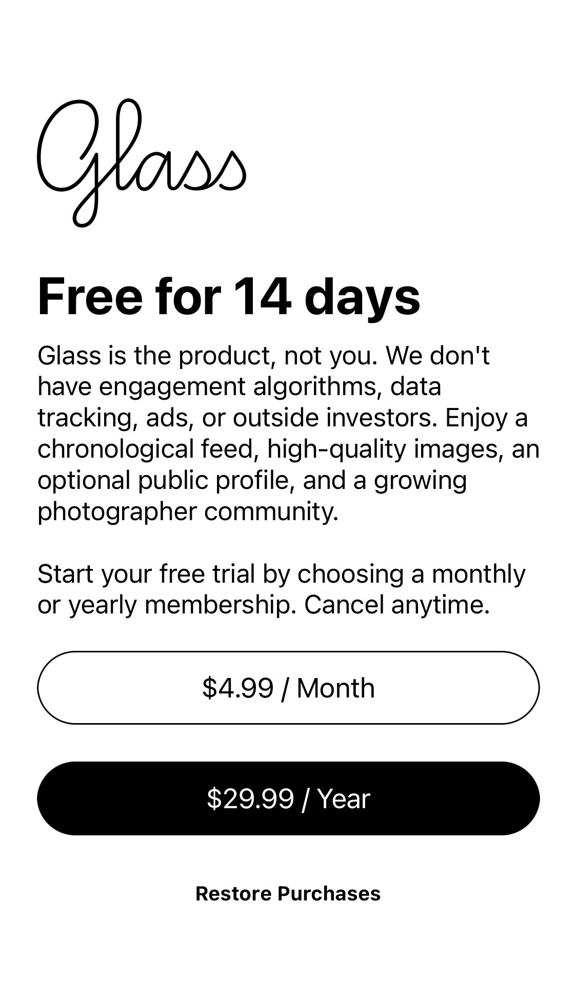
"Free" but first say how much you'd like to pay 😒. Also, an app-only experience for looking at photos? Come on. @tryglass
Requiring online service accounts for operating something you own isn't just a tired form of DRM, it also creates terrible UI/UX, Microsoft.
For that same reason, Meta/QuestVR deserves equal shame.

Would be nice if I could see where I was going.
(source: Tesla)
The Apple AppStore experience is so garbage sometimes. Sure, hide details when things go smoothly, but when they don't, let users know why.
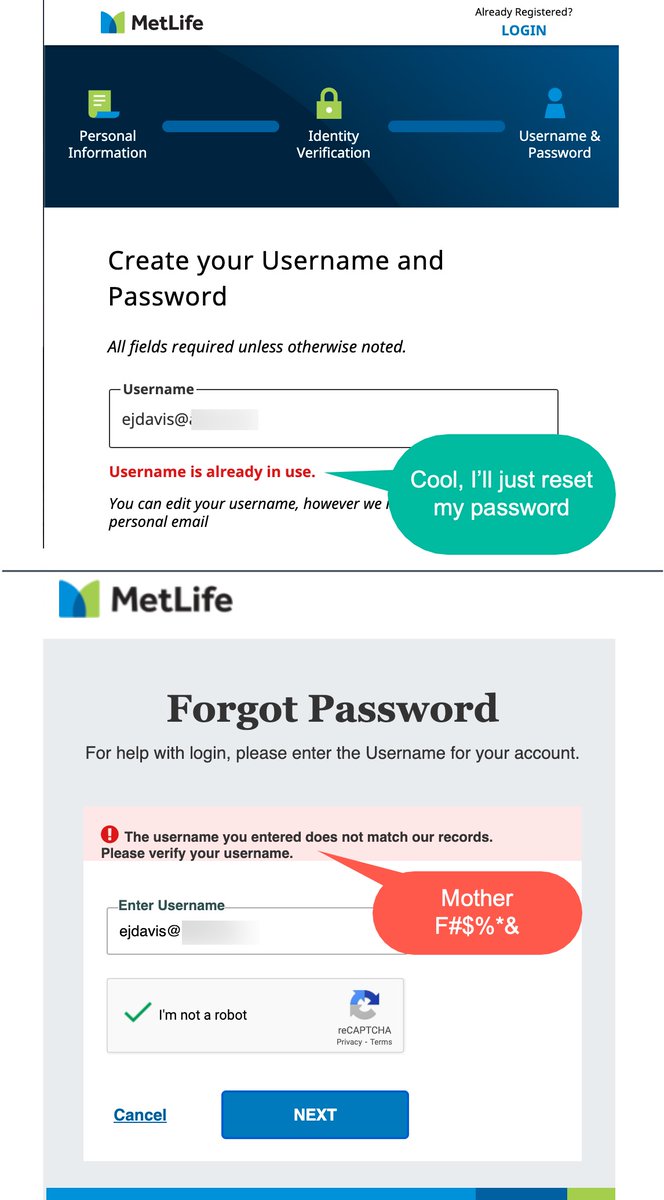
Haha, OK internet. Joke's up. Stop your conspiratorial bad #UX plot. I'm a good guy. @MetLife
(Via @erikdUX)
Same mistake made by so many soap dispensers, towel dispensers, passport readers, etc.
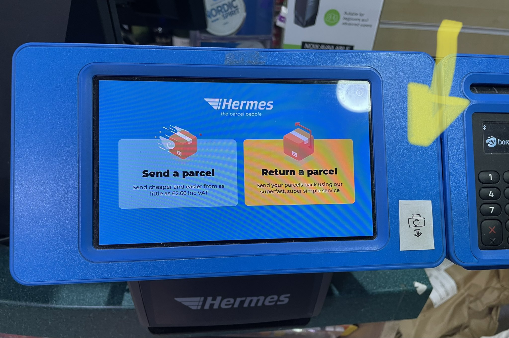
If things aren't visible, how do expect users to know where they are, @Hermesparcels?