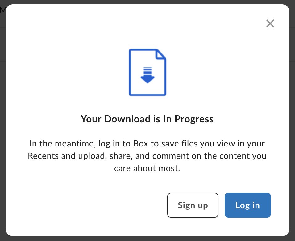
Pops up immediately when you click a download link and makes people think they need to sign up when they actually don't - the actual download starts 5 seconds later.
Completely unnecessary and incredibly confusing. Stop it, @Box.
Pops up immediately when you click a download link and makes people think they need to sign up when they actually don't - the actual download starts 5 seconds later.
Completely unnecessary and incredibly confusing. Stop it, @Box.
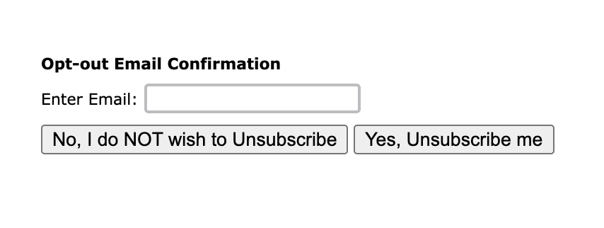
Why the fuck would you add another button to an unsubscribe form? A simple "Confirm" would have sufficed
(Source: Silverpop, now part of @IBM)
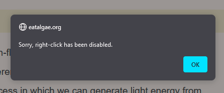
Maximum annoyance with zero benefit. @eat_algae
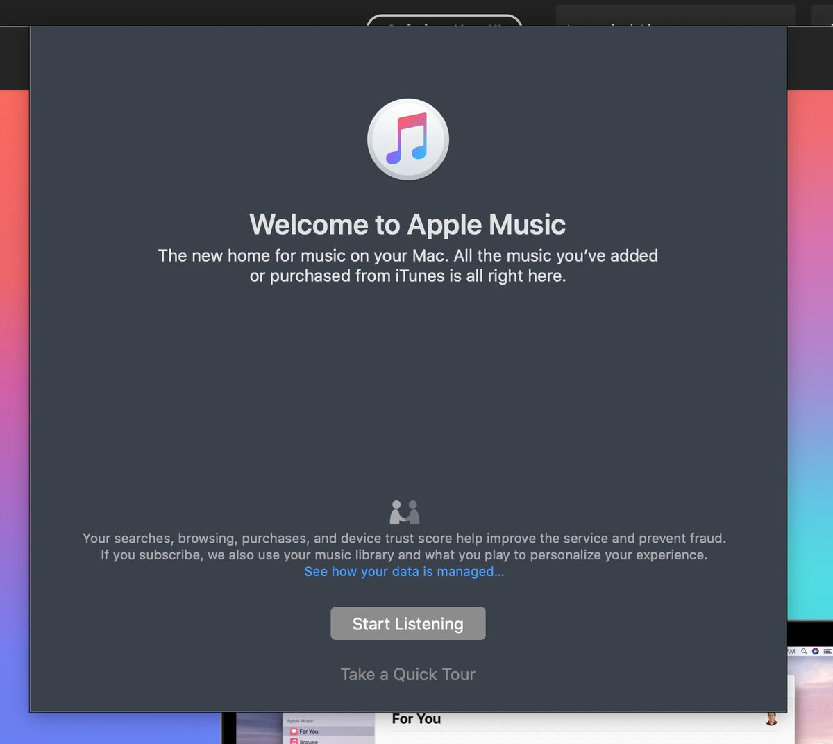
God forbid you accidentally open Apple Music and get confronted with the most annoying pop-up dialog with only choices: "Start Listening" or "Take a Quick Tour". Top left X is grayed out.
If you feel compelled to trap me, what does that say about your software @AppleMusic?
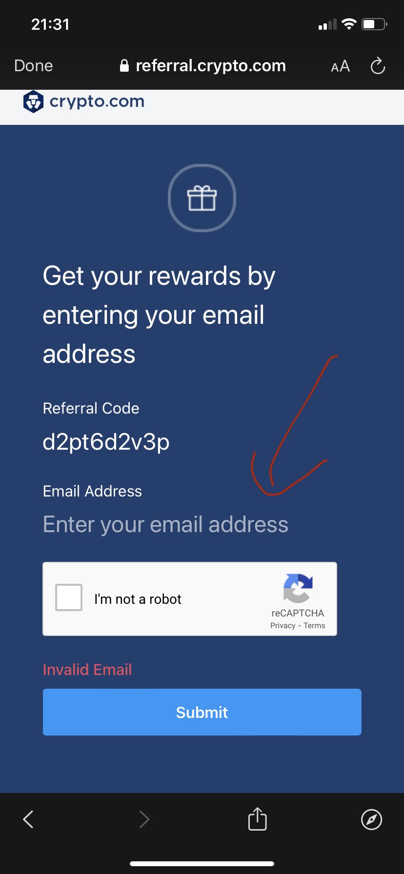
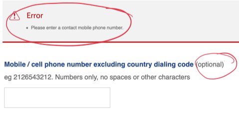
Form fields have affordances. Don't destroy them. @cryptocom
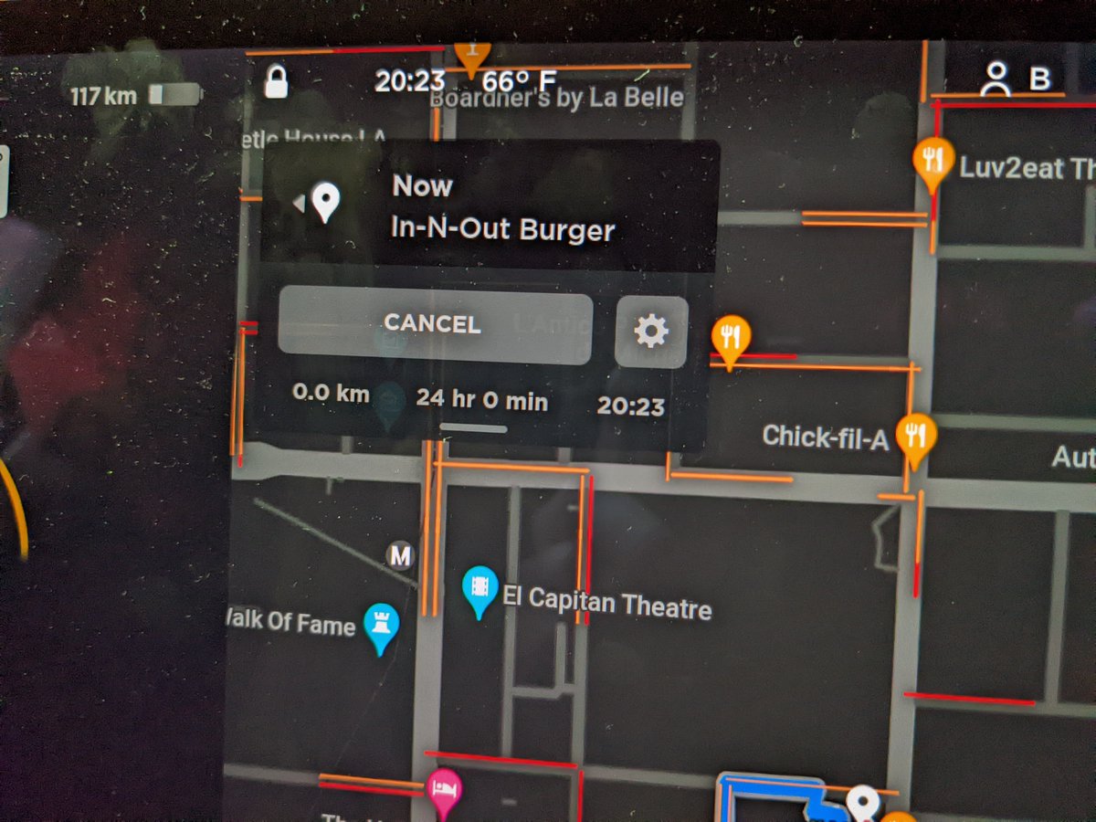
How does this calculation work, exactly? @Tesla

Awful example of obtrusive UI that gives you no other option than "Complete setup", whether you want to or not.
The "X" close button purposely doesn't appear until the next step. Thanks, @Microsoft!