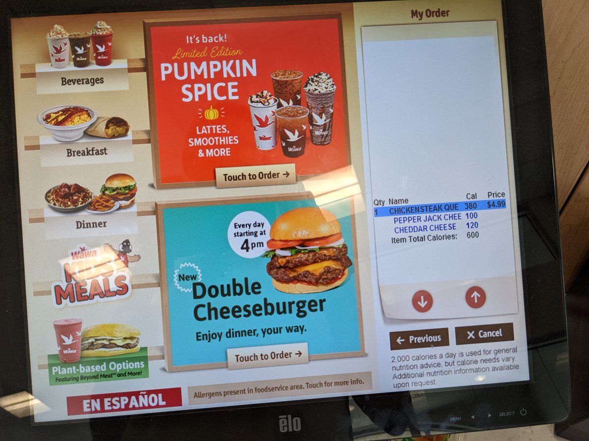
Seems @Wawa missed the memo on good ecommerce UI... How the fuck do you proceed to check out?
Seems @Wawa missed the memo on good ecommerce UI... How the fuck do you proceed to check out?
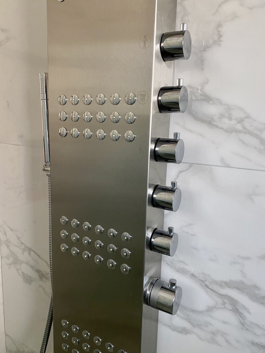
This one might need to go in the bad shower UX hall of fame.
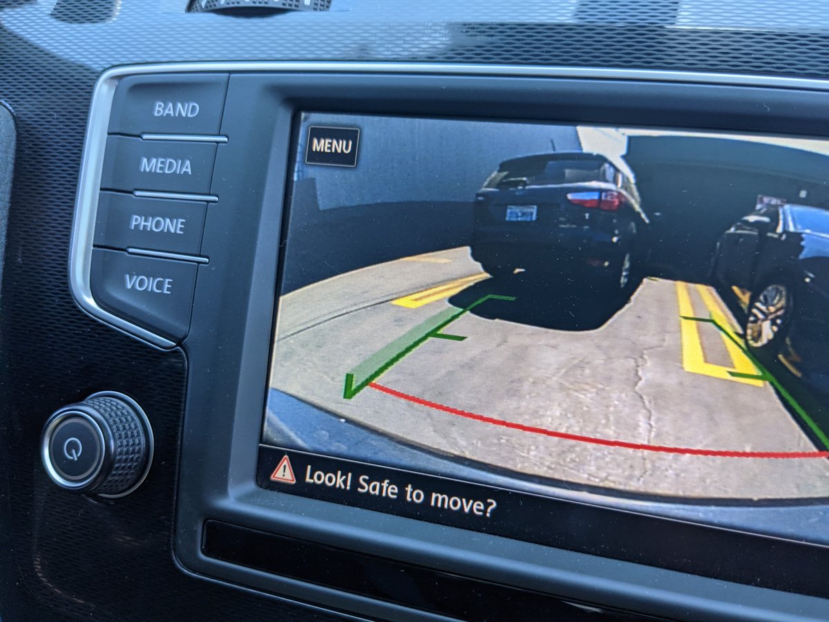
A condescending UI reveals a thing or two about how a company thinks about their users @VW
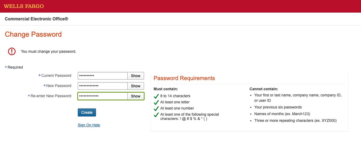
Right. No names of months, but don't go over 14 characters. That's too many. @WellsFargo 😒
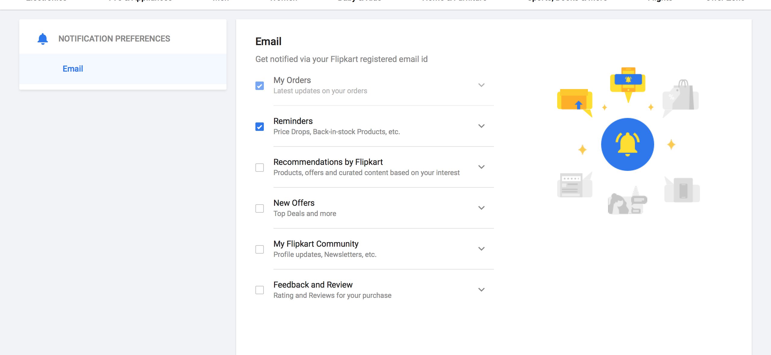
If you decide to forego the affordance of a "Save" button and auto-save users' preferences when they modify inputs, at least give them a notification.
Without either I have no feedback into what's happening.
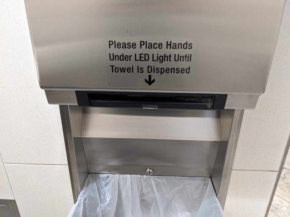
People will often attempt to compensate for unintuitive interfaces by adding excessive text instructions.
Which begs the question: why is it so hard to make a simple and intuitive automatic towel dispenser? @bobrickinc
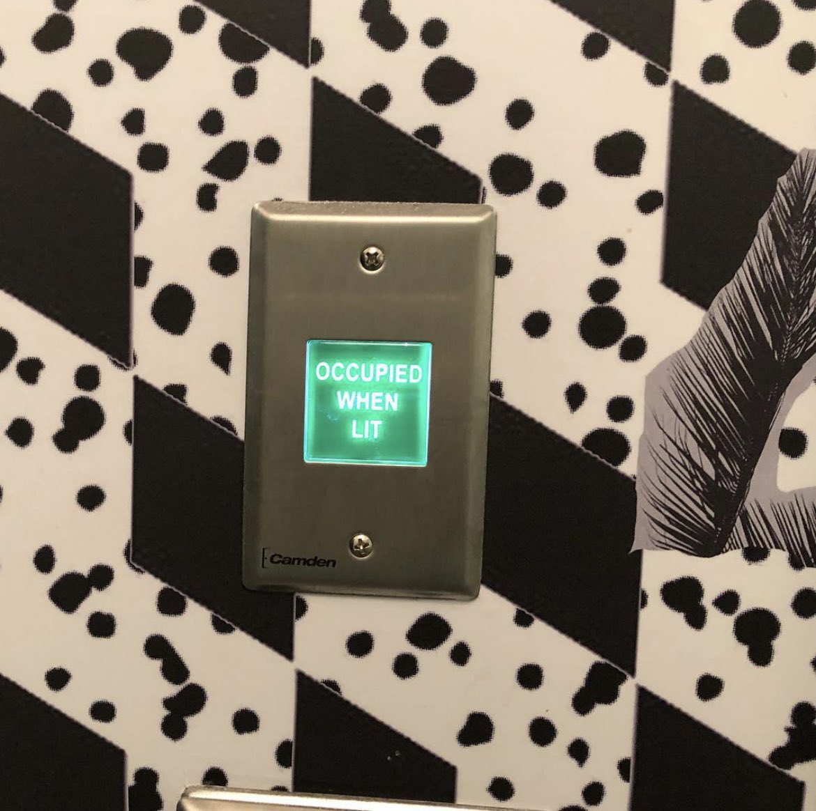
Good intentions, bad use of color
(Source: @vponamariov)

This is the worst UX I’ve seen. Didn’t find how to lock the door until I was exiting the bathroom 🤦♂️
(Source: @vponamariov)
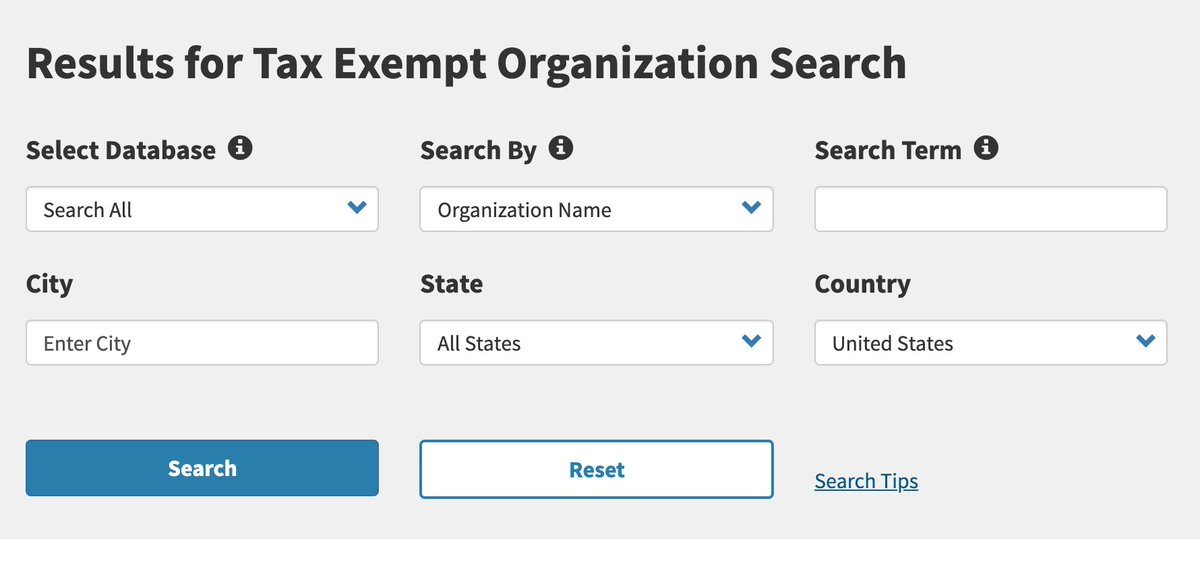
Search forms almost never need to be more than just one text box - don't overwhelm users with lots of options, @IRSnews. (Or put it on an "Advanced Search" page, at least)
And for god's sake, "Reset" does not deserve to be the same size as the "Search" button. Nobody uses that shit.
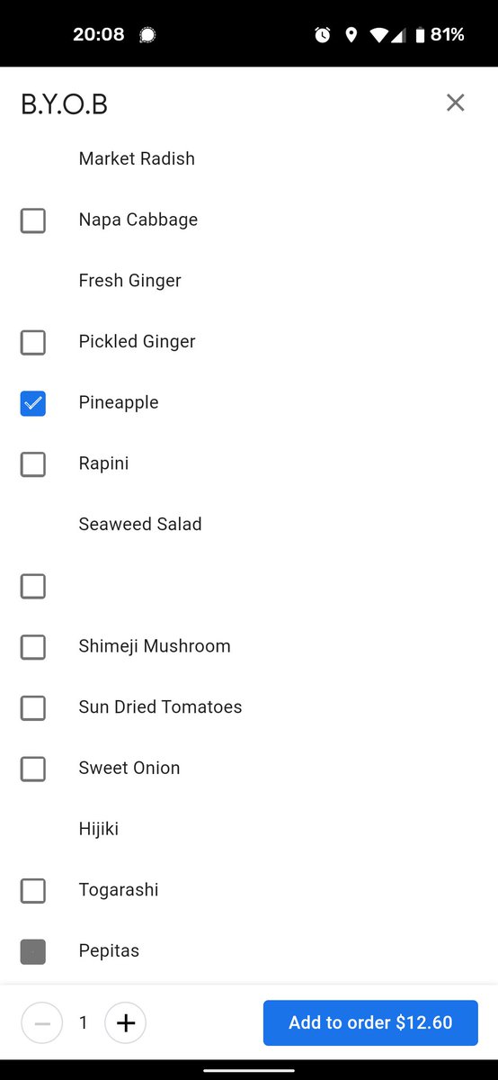
UI checkbox party at @Google, but some of you are NOT invited.