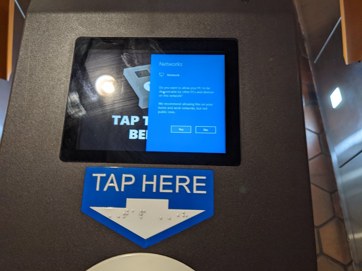
Your fare gates are running Windows? Yikes @wmata
Your fare gates are running Windows? Yikes @wmata
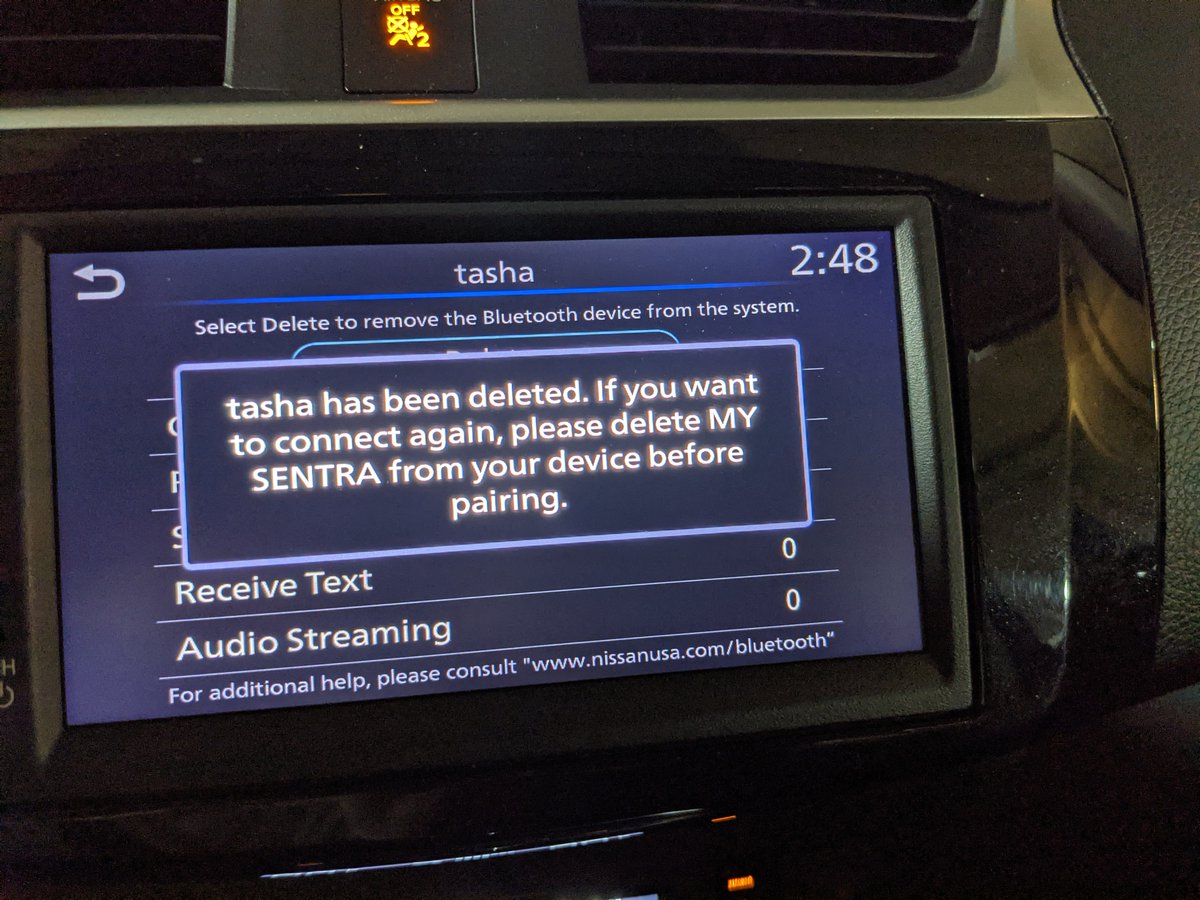
Nissan's shitty OS uses timed modals without any buttons to confirm or dismiss. This makes things like doing things multiple times extremely tedious and time-consuming. Ugh @NissanUSA
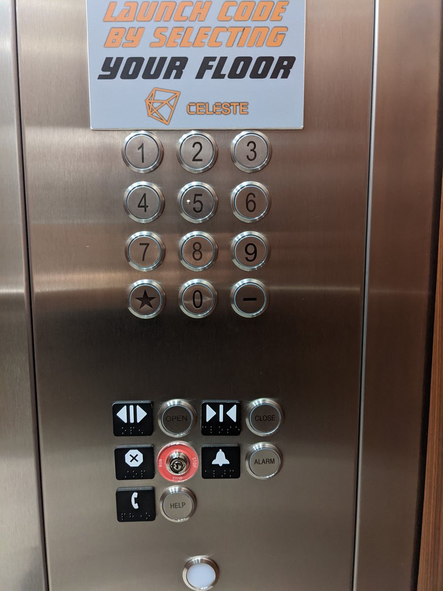
An elevator is not a phone 🤦♂️
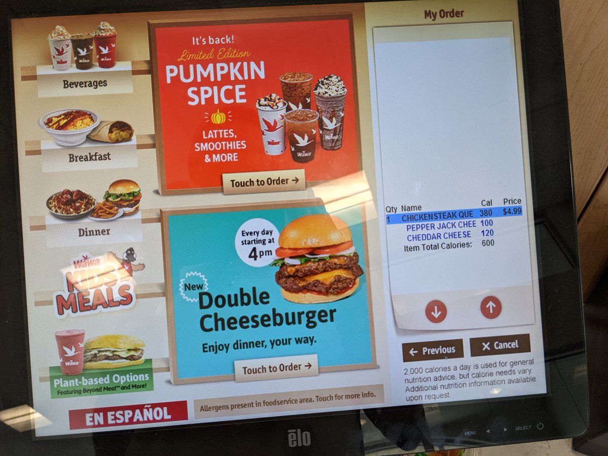
Seems @Wawa missed the memo on good ecommerce UI... How the fuck do you proceed to check out?
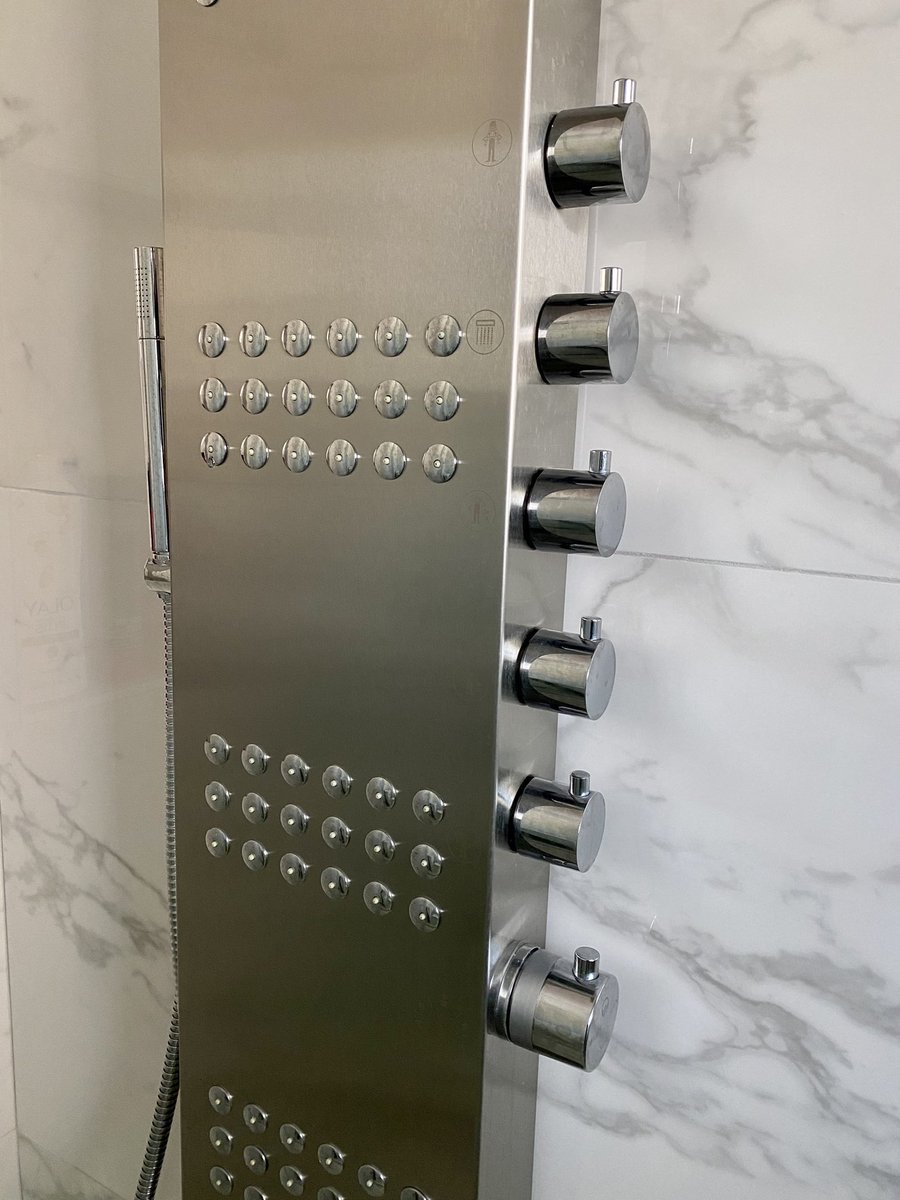
This one might need to go in the bad shower UX hall of fame.
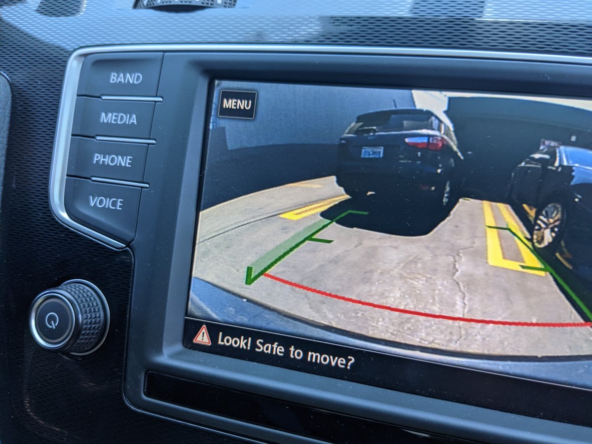
A condescending UI reveals a thing or two about how a company thinks about their users @VW
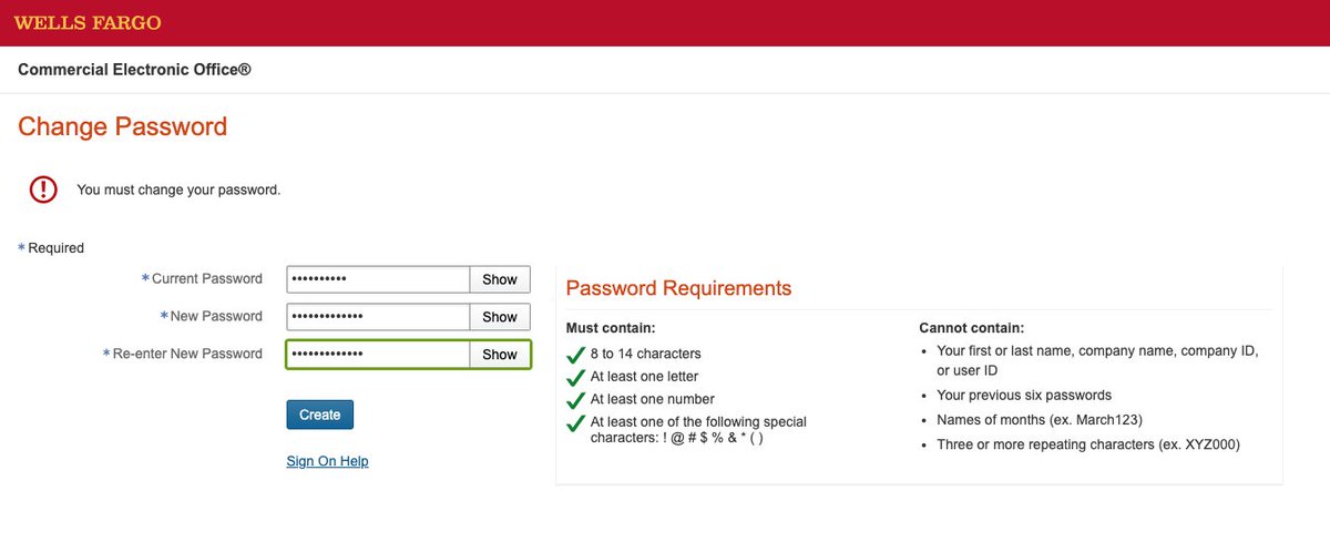
Right. No names of months, but don't go over 14 characters. That's too many. @WellsFargo 😒
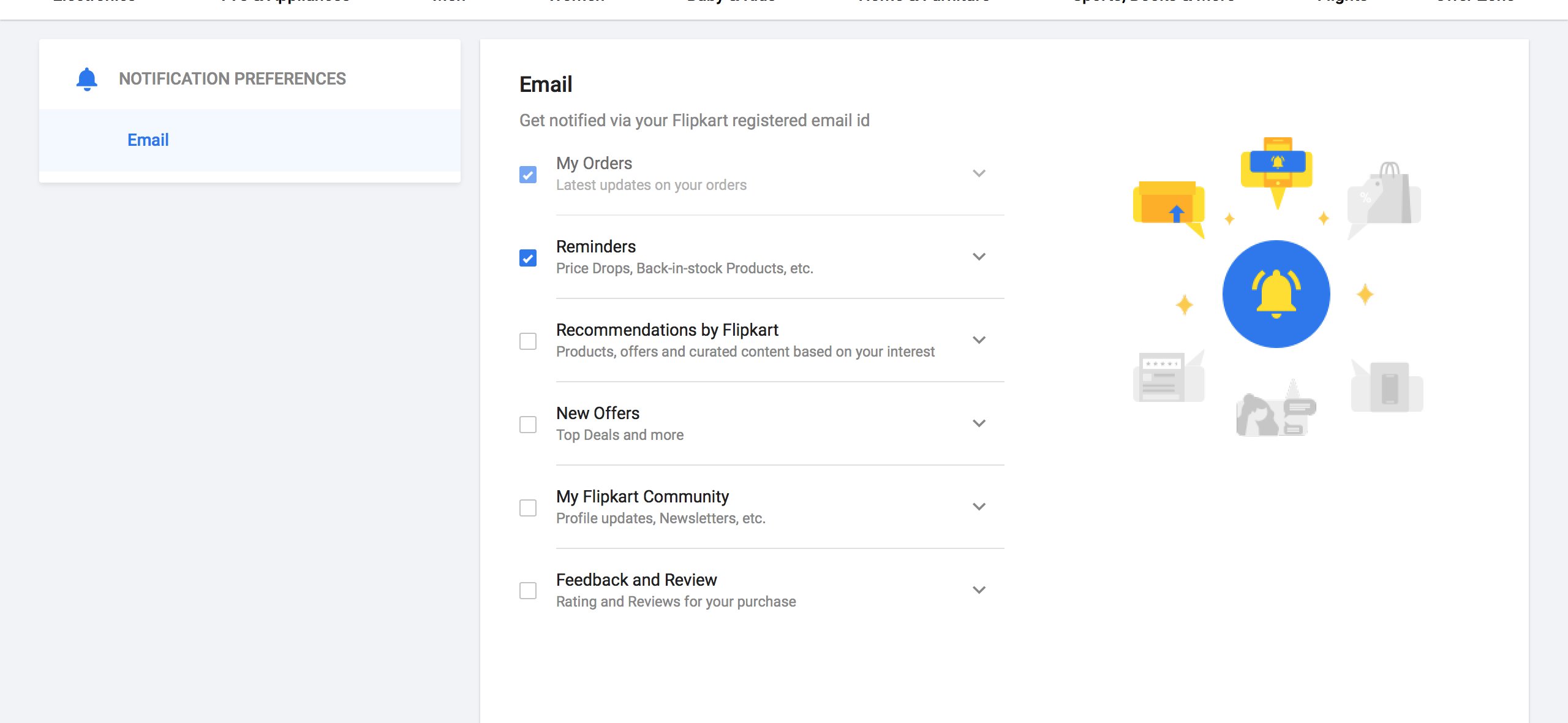
If you decide to forego the affordance of a "Save" button and auto-save users' preferences when they modify inputs, at least give them a notification.
Without either I have no feedback into what's happening.
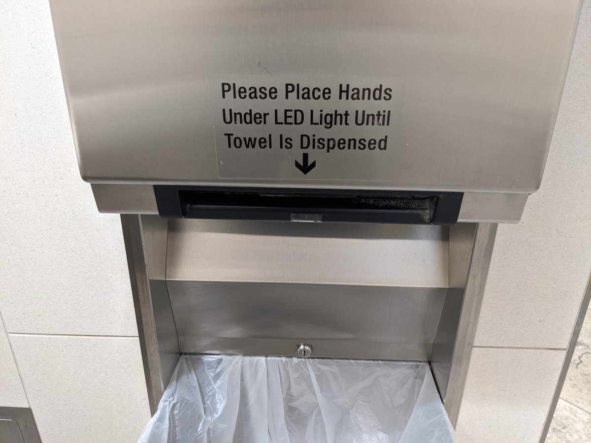
People will often attempt to compensate for unintuitive interfaces by adding excessive text instructions.
Which begs the question: why is it so hard to make a simple and intuitive automatic towel dispenser? @bobrickinc
Good intentions, bad use of color
(Source: @vponamariov)