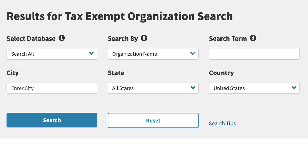
Search forms almost never need to be more than just one text box - don't overwhelm users with lots of options, @IRSnews. (Or put it on an "Advanced Search" page, at least)
And for god's sake, "Reset" does not deserve to be the same size as the "Search" button. Nobody uses that shit.